GET GROOVING AND MOVING YOUR BUSINESS

Facebooktwitterredditpinterestlinkedinmail


One of the first steps in starting your own online business is making a website.  This website is your place of business and must be treated as such.  Your potential customers will visit your site and decide within seconds if they will stay or go.  Turning these fast movers into buyers is one of the major obstacles in building your new business.

Below are 10 things you can do to increase your website’s conversion rate:

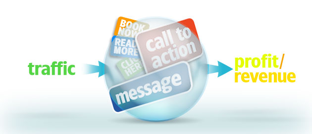
Call to Action – Telling your visitors what to do can help turn their indecisiveness into action.  Tell them what to do to begin the ordering process.  Tell them why they should buy from you and that they should “Buy Now”.  Tell them to Click Here to make the purchase. Give clear and concise instructions.

Easy Navigation – Do not make your site a maze for your visitors to try and navigate.  Have a simple, clean design with an easy navigational menu.  Use short, straightforward, easy-to-read paragraphs.  Make all your pages uniform and professional.

Be Direct – Write your page copy like you would talk to your customer.  There is no need for fancy words.  You do need to be professional but your web pages DON’T need to be written like a complicated legal contract.

Contact Info – Always have your name and contact info on every one of your web pages.  Be sure to write an About Us page.  People will NOT trust you if they do not know who you are.  Make up a Privacy Policy page so your visitors feel secure, which will add to that trust.

Professional Graphics – Graphics can assist in increasing sales but do not use the childish looking cartoon clipart.  Use professional well-designed graphics.  There are some sites where the cartoon clipart will fit but most will need sharp clean professional graphics.

Easy Ordering Process – One way to lose a customer is by having a long, drawn-out ordering process.  Having to click through too many pages to order will have your potential customer clicking to another site.  Be sure your shopping cart is secure and doesn’t ask your customer to write a book or click to the moon!

Upfront with Prices – One thing that makes me leave a site very quickly is if they try to hide their prices.  Even if your prices are a bit high, you will be better off to be upfront with them than to try and hide them.  Also, have easy access to your shipping rates and return policies.

A sense of Urgency – Sometimes people need a little help deciding if they should order or not.  Creating a sense of urgency can help them make that decision.  Limited Time Offer, Limited Supply, First 10 Customers, Buy Now for Free Gift.  All these types of phrases help get the customer in the “Buy Now” frame of mind.

Stress the Benefits – Be sure to explain what your products and/or services can do for your customer.  Benefits sell more than features.  For example:  If you are selling office chairs, be sure to tell them how it will help their posture thus minimizing back pain instead of explaining what the chair is made from.  Let them feel it and know the chair will support their spine rather than going on and on about the fabric.  People want to know what your product can do for them!

Make Your Visitors Feel Good and Appreciated – If your visitors feel good and appreciated just for being a visitor, then they know they will be treated well as a customer.  Give a free gift just for stopping by.  Give them a discount on their first order.  Let them know you appreciate them and thank them for even stopping by your site.

All these things can help sway a person’s decision “To Buy or Not to Buy”.   Try as many as you can and see how effective they can be.


Please feel free to send us your comments and keep in touch with me and my team.

Like/Share this blog post as much as possible.

Thanks a million for helping to spread this information.

Facebooktwitterredditpinterestlinkedinmail

Basic Web Cosmetics To Help you Grow

Facebooktwitterredditpinterestlinkedinmail

Hello Folks,

Today I like to share with you what kind of basics to have on your website(s). As I am learning everyday bit by bit. Ask yourself what sort of data your visitors hope to discover on your website(s).

Here below I hope to make clear for you which path you may follow to attract your digital visitors at all time. It is NOT an easy road. Let that be clear.

It appears to be something so basic yet in all actuality, making sense of what to incorporate on your site isn’t simple. It takes a great deal of testing of thoughts and a learning of how individuals act on the web. Be that as it may, there is some substance that each site ought to have and no doubt, you’re feeling the loss of some of it. Different things aren’t so direct.

Every day I am scratching my head how to grow on the net.

The basics aren’t so basic. For reasons that make web experts scratch their heads, some websites are missing the most obvious content so let’s lay out the non-negotiables.

Set Your Logo at the Top of Your Site-

Keep your design simple. People expect to see your logo in the upper left corner of your site. It could be in the center but make sure it’s there.

Clear Company Name/Blog Name-

Looking “trendy” doesn’t make you exempt from including your company name. And it can’t be embedded in an image. Google can’t read images so if your company name isn’t in text format, Google won’t see it.

Your Contact Details-

address with a clickable Google maps link if you have a physical presence and clickable phone number so people can easily get in touch with you. This information should be easy to find within seconds. A contact link in the foot and/or header is ideal.

What Are You Doing-

At the top of your website, you should say what you do in as few words as possible. Uber has an image of a smiling person in the driver’s seat of a car with text that says, “Get there.” You may find it hard to be that concise but that’s the idea.

Text About Them Rather Than You-

You’re proud of your business, and you should be, but your customer probably doesn’t care. Unless you’re writing an “About” page, nobody wants to read how many clients you’ve serviced or how your service is “top-notch” or “better than the rest.” They want to know how you can solve their problem. Speak to that.

Content Should Constantly Change

If your website is stale, your customers will believe that your business is too. Keep content fresh, relevant, timely, and all about giving to them in some way.

Standard Pages-

You still need an about page, a contact us page, and a homepage but for informational purposes, don’t add much more. You don’t need multiple pages of company history or a page that has the logos of everybody you’ve worked for. The less pages the better.

E-Commerce Sites

Now that you have the basics for all sites, let’s look specifically at e-commerce sites. E-commerce is all about selling but that doesn’t mean that it’s a total hard sell the whole time.

A Blog-

You may or may not need this depending on your offerings. If you’re a specialty e-commerce site, a blog can make a lot of sense. Mr. Porter is a UK based specialty menswear e-commerce site well known for their blog. Articles like, “What to wear to the Gym this January” and, “A Dopamine-Releasing Recipe From an Expert Chef” are examples of how the company creates an immersive experience that speaks to a lifestyle instead of just selling.

User Generated Content-

Social media has changed how we shop. We care what the company tells us but we put more weight on the opinions of customers just like us. Have a place for people to post reviews of the products/Goods/Services you sell to the world.

It’s All About The Price-

Don’t be shy about the putting the price where people can see it right away. You want qualified buyers and they don’t want to waste their time. Stay away from things like, “click here to see the price.”

Easy Purchasing Experience-

The more the customer must click, the more likely you’ll lose the sale. As you think through content on your site, how can you get them from learning about the product to entering their credit card information the fastest?

 Lead Generation Sites

Lead generation sites aren’t as much interested in directly selling the customer a product or service—although they might be later on. For now, they want to build a list of qualified people or want to generate traffic for ad clicks or other monetization strategies that don’t include direct selling. Often these are blog sites. Here are a few items a blog site should have.

A Sign Up Form-

Actually, nearly every site should have a sign up form but for lead generation sites, getting somebody onto your e-mail list is the ultimate win. Popups still work but people are growing increasingly annoyed by them and Google is reportedly now penalizing what it calls “intrusive interstitials.” Google doesn’t want popups that cover main page content where the user has to click off of it to continue on the site. You still need a sign up form but how can you do it without annoying your reader?

An RSS Feed-

Yes, RSS is getting a little old but it’s still widely used in mobile apps and computers. For people who read a lot of blogs, an RSS feed is how they know you posted a new article.

Video Content-

You can still get a lot of mileage out of text posts but content is quickly moving more toward video. Your phone provides a great a way to get into video blogging and services like Facebook Live allow for great content without a lot of work.

Expert Posts- You’ve likely noticed that everybody seems to have a blog now and many have blogs about content they’re not experts in. Find experts in the field and interview them. Make blog posts highly authoritative and valuable.

Intentional Call to Action- If your goal is to get them signed up on your e-mail list, have a sign up call to action at the end of every post. You might even embed a sign up form into the post. Don’t let them read your content without asking them to sign up unless you have an intentional reason.

Bottom Line

Don’t forget about the basics but depending on the type of site, there are other items you should also have. Like anything with content marketing, test, retest, and test again. Be willing to give up what you believe are good ideas if the data tell a different story.

I hope to have provided you some valuable information to hit the road. I am moving further with my team. This is not all, if you have more to share just share them in the comments or send us an email.

Team Blogzynergy.com

Facebooktwitterredditpinterestlinkedinmail

How to Write a Great Exploding Call to Action

Facebooktwitterredditpinterestlinkedinmail
Advertise you business right here.

Sometimes it is very difficult how to start your call to action. Here are some simple sentences to help you out  from this problem a lot of bloggers are facing every day.

1. Use Power Words

Great calls to action are emotional. They don’t waste valuable space with words like, “just.” They use words like “dream” or “million.” How about “Be the first” or “Find Your Million Dollar Idea Today.” All of these provoke some kind of emotion. Looking for some awesome power words? Just ask Google to assist you quickly.

2. Put Your CTA in the Right Place

Just like in real estate environment, the 3 most important words in digital marketing are location, location, location. Tons of research exists to tell you how people read a web page—and some of that research is actually useful. You might think that your call to action should be at the bottom of your page after all of your finely crafted sales copy but some people don’t want to read all the fluff. Some people will simply want to check out the offer without reading. Others may be ready to buy after one paragraph while others may completely miss the call to action if it’s only at the bottom of the page. That’s why a few CTAs in various locations on the page may work best. Try them in different places and start with these guidelines:

  • RED, Green and Orange buttons tend to convert the best.
  • Use first-person language. “Get My Free Report” instead of “Get Your Free Report.”
  • One of your calls to action should be above the fold so visitors don’t have to scroll to find it.
  • One action is enough. Tell your customer what you want them to do. Don’t use the CTA to present choices. You could give them a few choices at checkout, instead.

3. Keep It Short.

Having the gift of gab may make you a top-notch salesperson in face to face conversations but online, it’s all about getting to the point. The fewer words in your call to action, the better, in most cases. Take this 3 points in good consideration:

1 – Let XYZ company tell you how much it will cost to remodel your kitchen

2 – Call today for a free estimate!

3 – Let us make a person to person appointment !

Which of these two calls to action are most likely to get a response? The first call to action isn’t actually a call to action, and it is long and wordy. Plus it focuses on letting the XYZ company do something and that it’s something that will cost money. The second variation is short, to the point, tells the consumer to place a call, and focuses on the free estimate, not the cost of the work.

4. Test The Thing More Then Once

There’s a lot of science behind the call to action but the science is only a starting point. All the statistics and best practices may not work with your audience so test everything. Try a few different text ideas, button colors, button shapes, locations, web page designs. Test each of these individually. It’s going to take a while to test everything but once you find the winning combination you’re going to see some fantastic results. Even the best marketers in the business test various combinations. If they can’t get it right the first time, either can you. Now get to work and write a Call To Action that will get people flocking to your business!

You are free to share more ideas in the comments………..Let it flow rich and big.

Facebooktwitterredditpinterestlinkedinmail